Silver Jewellery
Silver Jewellery

Kallista –

Brand Identity

Kallista offers pure, high quality handmade silver jewelry in contemporary designs, at affordable prices. Theri fine, eternal jewelry can be passed on from generation to generation! Their jewelry is designed to share all unforgettable moments & celebrations of life.


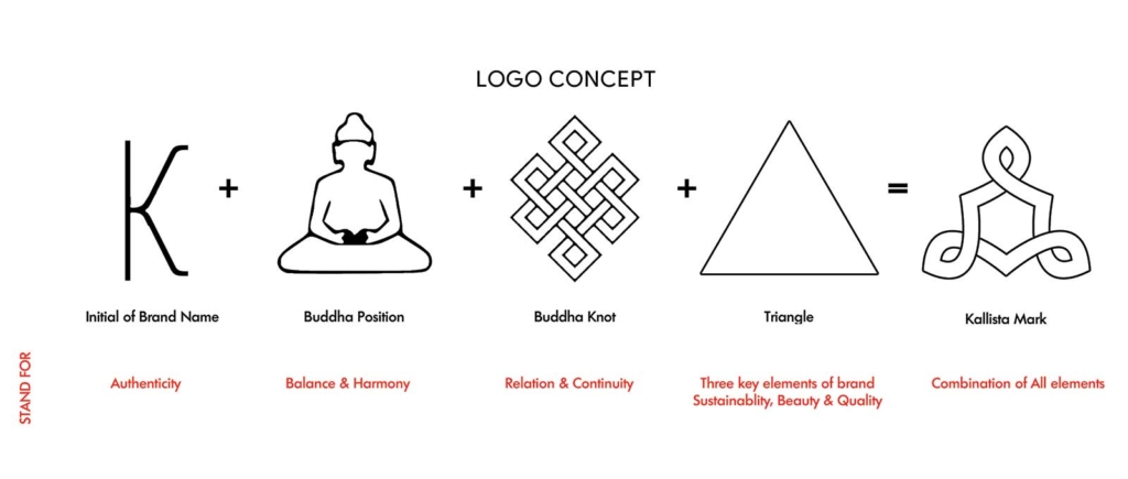
Concept of Logo: 
`Kallista’ means `the most beautiful’! Kallista respects the beauty & femininity of every woman and it also reflects in their tagline “It’s pure. It’s beautiful. It’s you”.
Thus, the brand is based on the three basic elements of Sustainability, Beauty & Quality. These three pillars of Kallista philosophy reflect in all the operations of Kallista.
The Kallista logo is inspired by the ‘endless knot’. It is a universal symbol of eternity, love and unity. The placing of endless knot on a gift is understood to establish an auspicious connection between the giver and the recipient. This is also known as “lover’s knot”. 
 

CHALLENGE

Brand did not had an identity, had no structured brand presence and identity

SOLUTION

We started with the brand positioning and strategy – understanding the market, studying all the other jewelry brands, creating and articulating the brand ethos and then translating them to everything – from brand logo to brand visual language and so on.
CATEGORIES

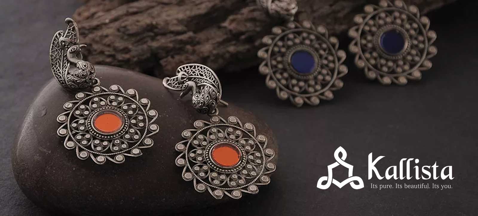
Brand deals in silver jewelry.

CLIENT

Jasmeet Kaur, Jaipur
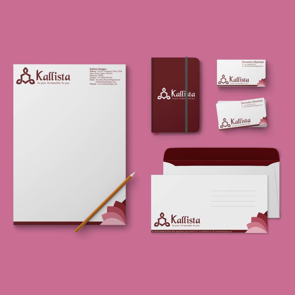
letter head, envelope and business cards kallista
phone and business card kallista
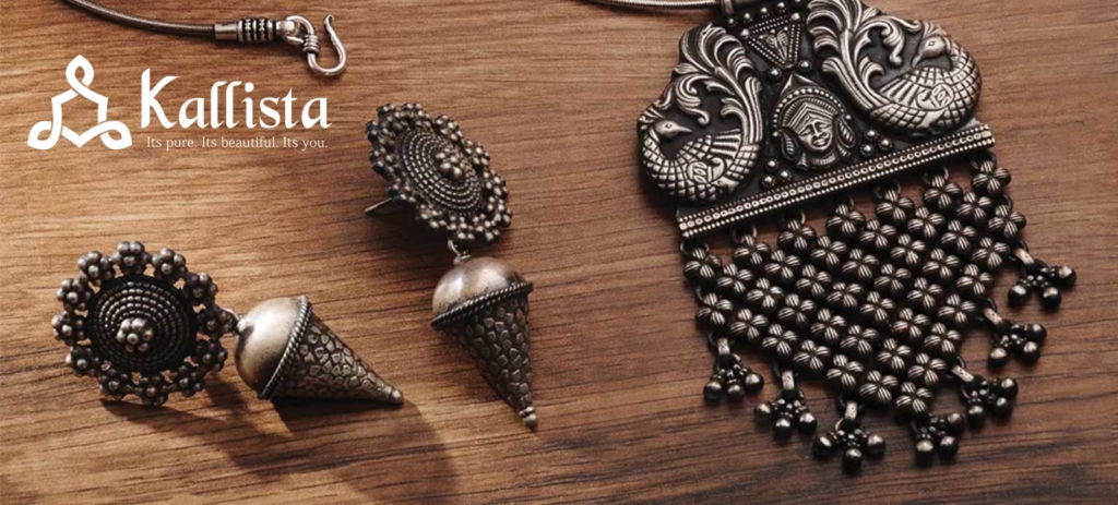
silver jewelery